As people move towards a more web-based life you find that many tips and ideas are still spread by the most common way; word of mouth. Only this time “word of mouth” is actually something that is posted or shared on a social network and not at the water cooler. What we read sometimes, however, is a little scary and somewhat demonstrates how word of mouth can sometimes be a detriment rather than a benefit.
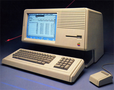
Many companies tout their experience on their sites. “We’ve been designing websites since 19 something and something”… “1,000 years of experience from immortal website designers”! All kinds of grand claims… heck, even we do it! There is nothing wrong with that, however, there is something to be said about staying current. Sure, you’re company has been around for years — does your website show that? How many sites have you been to that say, “Designing Websites for 15 Years” and their site LOOKS 15 years old? How many times do you click on a portfolio link and see the same basic design elements repeated over and over? What about the site that takes for god-awfully-long to load and then it’s just a big picture with a couple links? This is the problem with being an old web designer.
How does one avoid this problem? Answer: you must stay current!
Web design and web development are two ares where technology constantly changes the landscape. Specifically for development; newer updated codes and scripts allow you to do more with less strain on browsers. Are you one of those people who “needs Flash” on their website? Did you know you can do the same effects with just a script? You’d also save space making the site load faster AND it could potentially still be searchable where Flash is not. In order to keep going in this business you need to know what people want and how to best deliver it to them. With new scripts and programs coming out everyday it’s important to keep up — and keep on it! Web design typically follows trends but one trend that will never cease is clean design. A few years ago grungy graphics and websites were cool. A few years before that flash and shockwave were the rage. Before that there were animated GIFs and scrolling text… They all have their place in time however these trends are well passed their prime and probably should be put away with other childish things 😉
In short, you can tout your web presence and your experience all you want. However, if your website is out-dated, old, or just doesn’t work right — how does that make you as a company look? How current is your web team?
